Hungry for Better PPC Performance Analysis? It’s as Easy as Pie…Charts!

Analyzing your PPC campaigns with pie charts reveals actionable insights. And it does so visually. Pie charts show you how large a slice each campaign contributes to account performance. Being able to see these relationships spatially works better for some than just evaluating tables of numbers. With this analysis in mind, you can spend your digital advertising budget more efficiently because you can see which campaigns are succeeding and which are struggling.
This blog post shows you how to generate a pie chart from a pivot table and then manipulate that chart to pull out performance insights.
To see how to create a pivot table to begin with, see the previous post in this series—Pivot Tables: The Unsung Hero of PPC Performance Evaluation.
Generating a Pie Chart from a Pivot Table
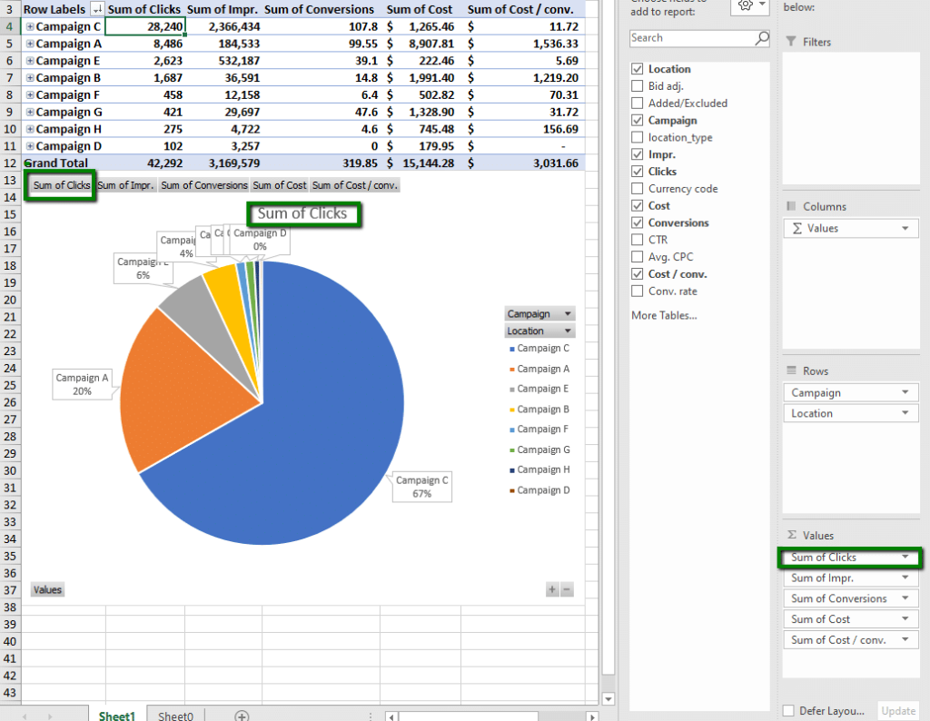
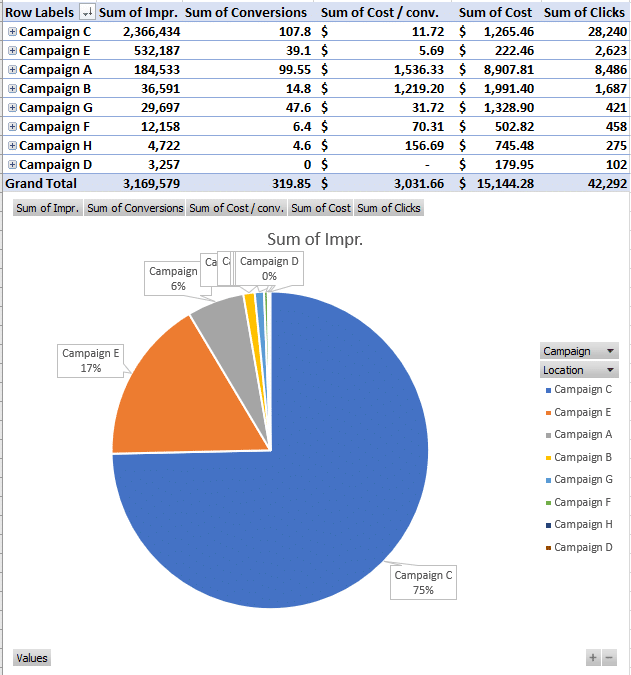
I’m starting from here:
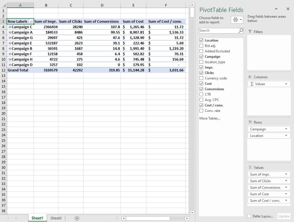
To generate a pie chart, follow this path: Insert > Pie Charts > 2-D Pie
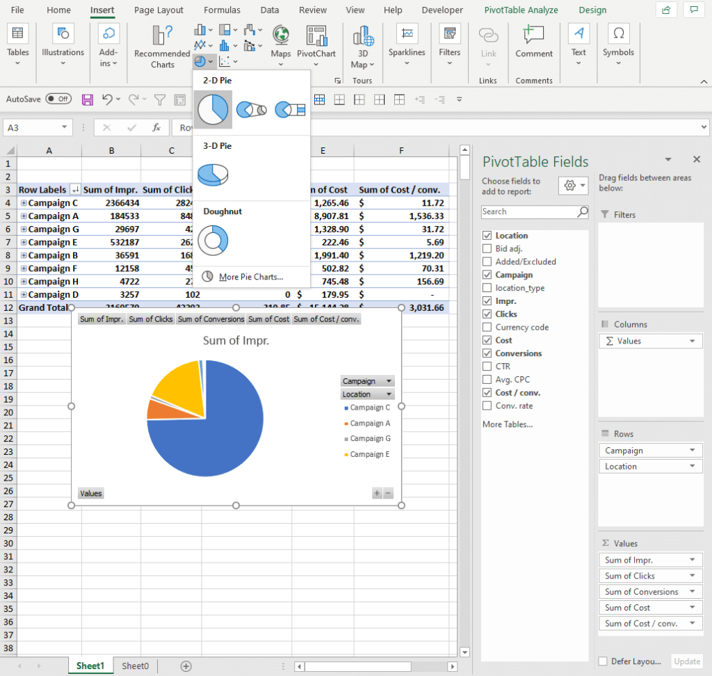
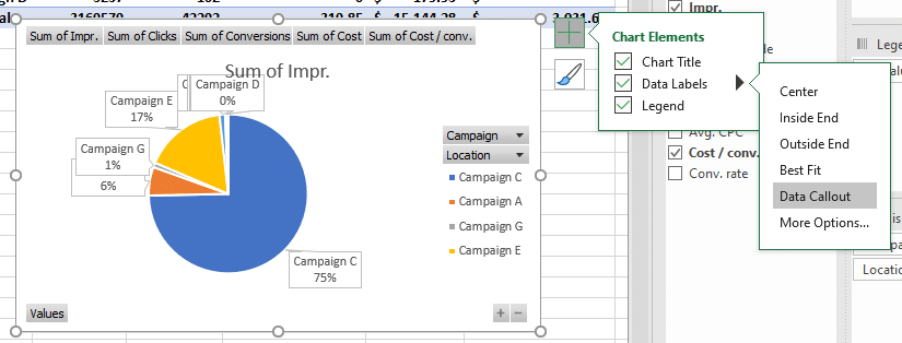
To show the percentages that each slice represents, let’s add data callout labels: Chart Elements > Data Labels > Data Callout
Note that the pie chart shows you whatever is the first metric in your columns. In this case, that’s Sum of Impressions in column B.
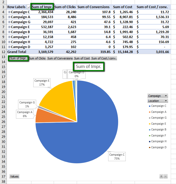
Further, the slices of the pie are displayed in the same order as the stats in the table: at 12 o’clock on the pie, you get whatever is in the top row of your first column. So here, Campaign C begins at 12 o’clock and sweeps around to nearly 9 o’clock because the Sum of Impressions for Campaign C (2,366,434) is in cell B4, which represents 75% of the total impressions for all campaigns (3,169,579).
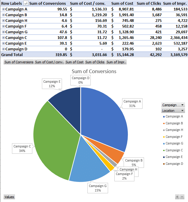
Adjust which values are displayed in the pie chart by moving another metric into the first position in the Values on your pivot table. Here I’m looking at clicks:
Continuing this process and sorting the pivot table by the other metrics reveals a rich picture of what Campaign C contributes to the account:
75% of Impressions
75% of Clicks
34% of Conversions
8% of Cost
And the 2nd lowest Cost/conv ($11.72).
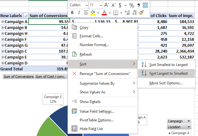
Keeping Slices in Order
To get the slices of your pie in order, sort the column of the metric you are examining in the pivot table.
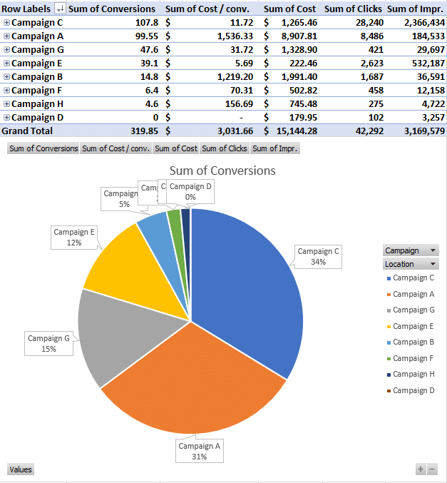
See how the slices are now arranged with the largest starting at 12 o’clock and sweeping around clockwise to smaller and smaller slices.
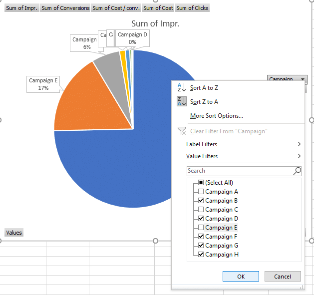
Removing Campaigns to Narrow Analysis
It’s easy to see the relationships between the big contributors to the pie chart for a particular metric. It’s harder to understand what’s going on at the lower end when those little slices are dwarfed by comparison.
Filter out the larger pieces of the pie to see what’s going on at the lower end. For example, let’s take out Campaigns C, E, and A to see what the bottom impressing campaigns look like compared to each other.
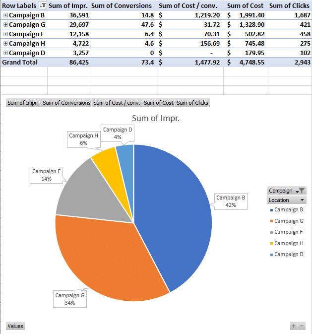
Now we have a better sense (visually) for the proportions between the 5 lowest impressing campaigns.
Switching to Location Analysis
A delicious thing about pie charts built on pivot tables is their versatility. Simply drag a different field to the top of the Rows area to change what you are analyzing.
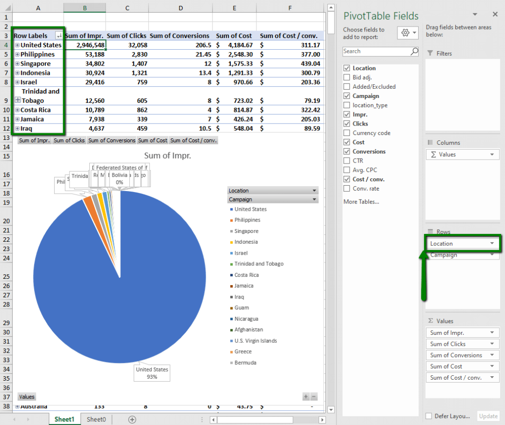
Now we are looking at impressions by location combined from all of our campaigns. The United States is dominating impressions with 93%. Sure, that’s clear. But how does the other 7% look if we expand it the size of the whole pie by taking out the US?
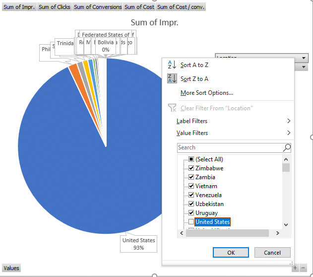
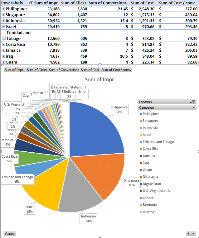
We can see that 6 countries contribute about 75% of the impressions once the US is taken out. So now we know what locations outside the US might be most fruitful to focus our marketing efforts on.
Analyzing a Single Campaign by Various Locations
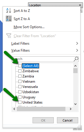
On the other hand, the US is clearly going to be the focus of our efforts within this account. Getting more granular on US performance, then, is essential.
Start by de-selecting all locations and enabling just the US.
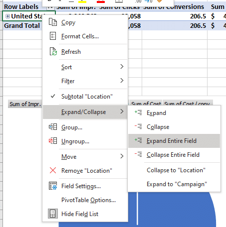
Then Expand Entire Field on the US to see how each campaign is performing in the US.
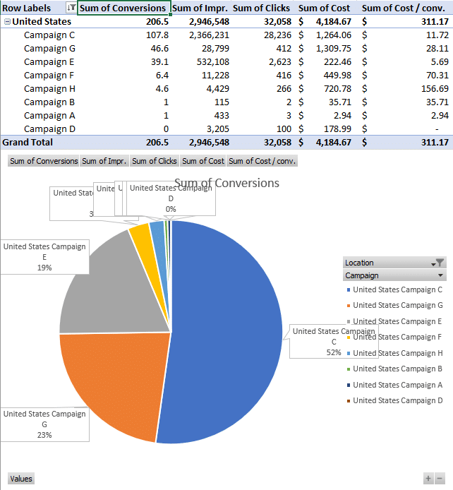
Storting the table by conversions shows that Campaigns C and G account for 75% of conversions in the US. We also see that Campaign E garnered 39.1 conversions at $5.69/conv, an even better CPA than Campaigns C and G.
What’s Your Favorite Flavor: Boysenberry, Cherry, Chart?
Whether you’re interested in a slice of location, apple, campaign, or pizza, pie charts are the thing.
I hope you’ve gotten a taste of how pie charts can help you get your eye in for evaluating what proportion of performance each campaign or location represents.
One final plug for the previous blog post in this series, which will show you how to create a pivot table to begin with—Pivot Tables: The Unsung Hero of PPC Performance Evaluation.
Check these out for more help with your PPC efforts:
- How to Pinpoint PPC Performance Changes
- Catch a Competitor Bidding and Ranking for Your Brand? Here’re Your Options
- Now It’s Free to List Your Products on Google
Analyze away!