Mobilegeddon: Or Why You’re about to Lose a Ton of Traffic

Ahhh April, what’s better than the weather warming… birds singing… and the flowers blooming?
Along with April comes spring, a feeling of freshness and a new start. April also has one of the most historically dreaded days of the year… Tax Day! Those who wait until the last minute run around all day from the accountant’s office to the post office and everywhere in-between.
Well, thanks to Google, this year the most dreaded day will no longer be the 15th! It will be TODAY: Tuesday April 21, 2015
…the day of
M O B I L E G E D D O N
Google’s Mobile Friendly Update!
What is Mobilegeddon? Are you ready? Did you wait until the last minute? What do you need to know? What do you need to do?
No worries, take a deep breath and allow us to guide you!
What is Mobilegeddon?
Simply put, Mobilegeddon is the day that Google will begin to give a boost in rankings to pages that have earned their mobile-friendly label in mobile SERPs.
Therefore, if you ranked highly for a specific keyword and have not made your site mobile-friendly, there is the potential that you will lose those rankings.
Unlike many other Google updates, Google has been more than fair with this update. They officially announced the update back on February 26th which is the same day that they launched the oh-so helpful, Mobile-Friendly Test. Playfully, the SEM Community has dubbed the day as “Mobilegeddon.” In the world of SEO this update has occupied a majority of the chatter and shaken up the focus for search engine optimization.
Top Facts to know about Mobilegeddon:
-
- The mobile algorithm update will be on a page by page basis. Rather than classifying your entire site mobile-friendly, it is actually possible to have some pages labeled as mobile-friendly while other pages are not. If time is an issue for you, check Google Analytics for your top mobile content and prioritize which pages to update first.
- The mobile update is in real-time. This means that as soon as you update your site and then Google crawls it, it will immediately be labeled as mobile-friendly and immediately benefit from the update. We tested this on a client in-house and can verify that this is true! (hint: fetch as Google in GWT use the mobile: smartphone option to submit the updated URLS)
- The update will only affect the mobile SERPS. Desktop and mobile SERPs are not the same. Today’s update will only have an effect on your mobile SERPs, therefore you can rank one page for desktop SERPs while ranking on a different page for mobile SERPs.
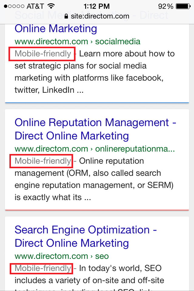
- Google has announced that they will no longer show URLs in mobile search results. Google has begun to replace mobile URLs with the site’s name and breadcrumb path. These changes will roll out gradually and will only affect the mobile search results.
- Responsive sites DO NOT equal mobile friendly! It’s very common for business owners to assume that just because they have a responsive site in place that they will naturally gain the mobile friendly tag. While responsive design will re-size the content of your site, you will want to be sure to avoid many common mistakes, including blocked JavaScript, CSS, and image files. (Have you checked your robots.txt file lately?) Allow Googlebot to see exactly what your users see!
Avoiding the Wrath of Mobilegeddon:
Do you want to ensure that your site doesn’t experience the wrath of Mobilegeddon? I sure hope so! Let’s take a look at a few things that you can do rather painlessly and fairly quickly without understanding web development.
Begin by checking your site on Google Webmaster Tools (GWT). If you do not have an account, you should! It’s free, it houses a ton of information about your site, and as I said, it’s FREE! Sign up HERE!
Once you have created or logged in to your GWT account, locate the Dashboard on the left side of the page and click the arrow for Search Traffic. The last item in this category is the Mobile Usability section which will show you not only which pages have mobile usability issues, but also provide links to guides on how to fix these issues. (Tools to prepare for an algorithm update? Again, demonstrating that Google was more than fair with this update!)
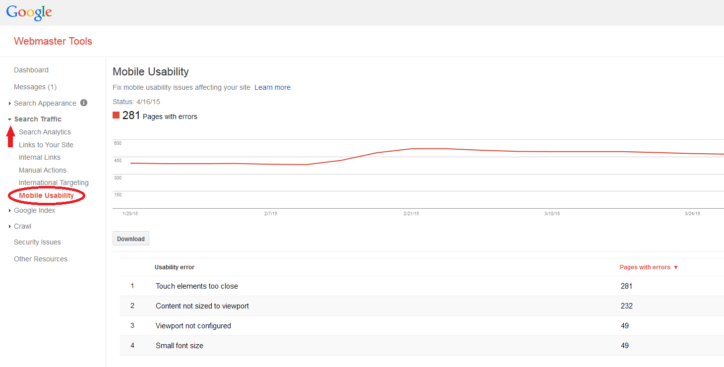
As you can see in our example, there are a total of 281 pages on this site with mobile usability issues. Below that you will see a timeline that will give you a quick snapshot of when there was a spike or decline in mobile usability issues. Google then breaks that down even further and will list which pages have which issues. (Please note that one page can appear in multiple categories.) When you click on each individual issue, you will see a list of URLs that are affected by that issue.
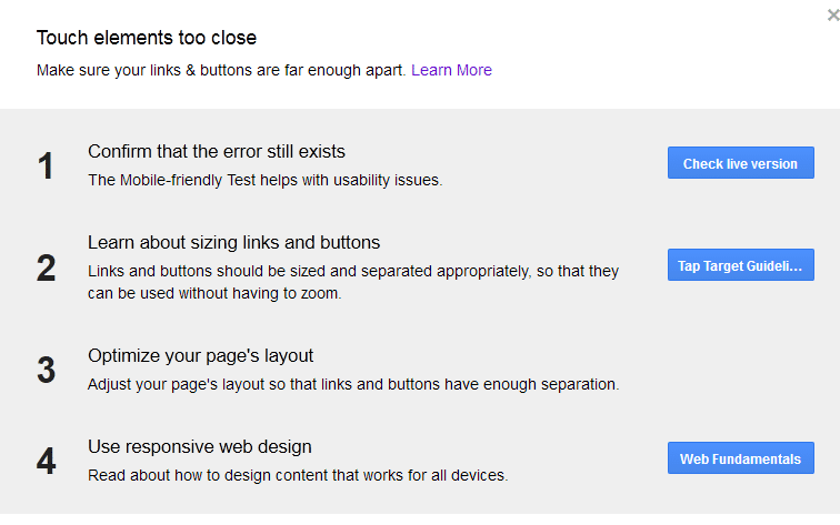
Once you have clicked on a URL, you will get a screen that will give you several options for testing or fixing the issues on that specific page.
The 4 Main Components to Determining Mobile Usability (and a layman’s definition):
- Touch elements too close
- Buttons, links, or form fields are too small or too close together to be used easily on a touchscreen.
- Content not sized to viewport
- Users have to scroll horizontally or zoom out to see the whole page
- Viewport not configured
- Code that gives the browser instructions for the page’s dimensions based on device
- Small font size
- Page copy is too small for users to read when not on a desktop
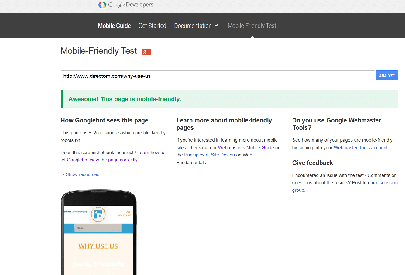
You can also check random pages on your site by going directly to the Google Mobile-Friendly Tool. This tool is available to the public and also free to use. Be sure to check several pages before assuming that your site is ready; as I stated earlier in this post, the update is on a page by page basis.
Should you fear Mobilegeddon?
As an agency, we have seen an array of issues and obstacles involving mobile usability issues; however, most have had an easy solution once the developers were involved. For the ones that haven’t, we dove in and conducted further research to find a fix.
Really, Mobilegeddon is just a play on words and should not be feared. While the amount of traffic that comes to your site varies greatly by niche, mobile use has surpassed desktop already and is forecasted to continue to grow. So, wouldn’t you want your users to have a good experience no matter what device they were on? Use Google’s mobile-friendly tags to your advantage (while you can) and complete your mobile site’s “spring cleaning.”
If you are still losing sleep over Mobilegeddon, I’d suggest you call us now!
To get more information on this topic, contact us today for a free consultation or learn more about our status as a Google Premier Partner before you reach out.

