Recent Examples of Successful Rebrands

Being on the edge of a rebrand is like standing on the edge of a cliff, wondering if there will be rocks amid the waves below. Of course it is only natural to feel more comfortable making the leap after seeing someone else safely find their way into the peaceful water.
Many well-known companies have seen great success in realigning their brand identity with their current goals, customer needs, and market changes. So if you’re considering a rebrand, it’s much easier to move forward if you know other companies have braved the waters—and lived to tell the tale.
Every year, the Rebrand Global Awards showcases the best of the best in brand transformations, demonstrating how a company’s brand can be its key asset. Building a solid brand identity is vitally important to your business’s success, and we think these rebranding examples from the 2018 awards got it just right.
1. Rebranding for flexibility – AT&T
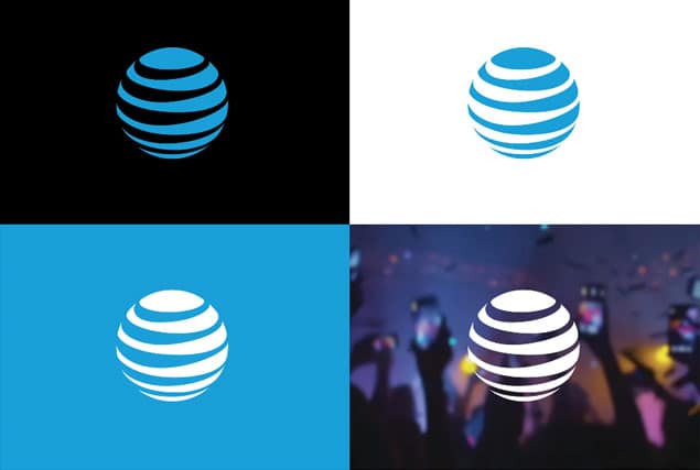
AT&T was looking to build credibility in new markets. Their use of bright colors and bubbly elements didn’t resonate with new audiences, or help the company stand out. Their branding strategy needed fit a diverse range of products and services, so their branding elements needed to evolve.
To address those challenges, the iconic AT&T logo was purposefully streamlined, and the color palette was refreshed to give the brand a more cohesive and recognizable look.

2. Rebranding for customer empowerment – GLPS
GLPS was suffering from an outdated, over-designed logo, combined with generic color palettes and photography. These uninspiring brand elements weren’t selling customers on buying into the company’s lightning protection.
By introducing a powerful, straightforward new logo against a backdrop of emotive imagery and photography, GPLS’s new look is tasteful and conveys the brand and services at a glance—and helps customers understand the company’s value.

3. Rebranding for a relaunch – McAfee
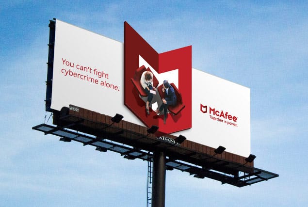
After realizing the McAfee brand identity still resonated with customers, Intel (who bought McAfee in 2010) decided to relaunch the brand.
All of the brand design elements converged into a clean and modern look for this long-running business, but the main focus was an update of the well-recognized shield logo. By modernizing the existing logo and introducing two-color elements that demonstrated two separate parts “coming together,” the logo perfectly encapsulated McAfee’s new tagline “Together is power.”

4. Rebranding for modernization – Ray
Ray is a perfect example of an established, decades-old business that needed to take a big step into the future without alienating loyal customers.
Operating with a “first name basis” ethos, shortening the company name into a single first name worked perfectly as the starting point for a contemporary overhaul. Paired with monochromatic color palette and impactful, purposeful imagery thrust this business into the 21st century while staying true to its history.

All of these rebrands have elements in common, and most have been successful by focusing on simplifying and streamlining. Busy logos, extensive color palettes, and generic photos have been replaced with clean, impactful logos, limited and purposeful colors, and relevant and emotive images to create memorable and instantly recognizable brands.
Ready to streamline your brand? Learn more from our rebranding guide, and schedule a consultation to work with us.

 800.979.3177
 +1.412.785.7671

